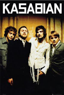
There isn't a definite colour scheme for this poster, but it is mostly black with hints of yellow and green. These colours are linked with dirt and nature, which could suggest that they are a naturalist band. The band name is written in bold white, with the font being the bands signature font. This allows for their fan base to identify the band easily, helping to the popularity of them as the poster may bring in new fans, while still attracting their old ones. The poster only shows the bands top half of their bodies, while their legs are faded into black, mirroring the top of the poster with the bottom. This also adds definition to the bands faces, as they are almost in the centre and the lightest part of the page. The band is shown to be close together by them hugging and standing close, this shows a unity between the band members and suggests that they have fun in making and producing their songs, which will attract even more of an audience. The poster seems to be ‘Beatleest’, with the four band members showing their unity again with the simple background and them as the main focus.
The clothes they are wearing seem to be military clothing items like the trench coats and the shirts they are wearing, and although some parts of this do link to old Beatle posters, it does show them unclean and not clean shaven as well as ruff. I feel this shows what indie bands are like in today’s climate. I like how the band are shown together as one, and I feel this is something I would like to do with my poster of the band. I also like how the background is ruff and shows paint that is scraped off, this may link to the band with the ruff, messy look they have.

No comments:
Post a Comment